
Jailene Ortez
Graphic Designer


About

Hello!My name is Jailene Ortez, and I am based in Hudson County, New Jersey.I graduated at New Jersey City University (NJCU) with a Bachelor in Art (Concentration in Graphic Design) in December 2019. Through my studies, I've gained in skills in Adobe Photoshop, Illustrator, and inDesign.I currently work for the nonprofit Spectrum Works as an in-house graphic designer.
resume
Graphic Design ExperienceSpectrum Works
Graphic Designer
Oct. 2022 - PresentCity of Jersey City
Graphic Design Intern
Sept. 2019 - Dec. 2019
EducationNew Jersey City University
Jersey City, NJ
Bachelor of Arts in Graphic Design
Sept. 2014 - Dec. 2019Sejong University
Seoul, South Korea
International Exchange Student
Feb. 2018 - June 2018
latest gallery
This gallery documents the latest marketing materials and client projects I have done for my current job: Spectrum Works, a nonprofit that creates job opportunities for individuals with autism.


blue day 2023
As an organization focused on empowering individuals with autism, every April Spectrum Works holds an Autism Awareness Blue Day event with its partner companies. I was tasked to create the design for the shirts that were sold as a fundraiser this year.
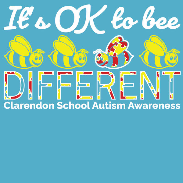
Claredon school
This was a design created for a regular client of Spectrum Works: Claredon Elementary School. Every year they hold a fundraiser selling shirts for Autism Awareness month.
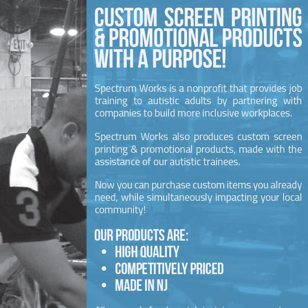
NJMEP Magazine ad
I was tasked to create an advertisement to market Spectrum Work's screen printing and custom promotional product service. The advertisement was printed in New Jersey Manufacturing Extension Program's (NJMEP) magazine, Manufacturing Matters.
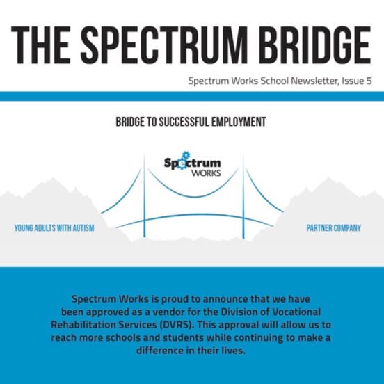
The spectrum bridge
Spectrum Works has a newsletter that is sent to potential and current high school partners. I was assigned to design Issue 5 and highlight the student interns working with Bergen Logistics, a partner company.
secaucus fire department
One client, Secaucus Fire Department requested a shirt design for Engine 1. Part of my task was to create a back design which was used for various shirt types.
secaucus police department
The Secaucus Police Department requested a shirt design for an Autism Awareness fundraiser they were holding. The design includes four logos and the phrase "Until All The Pieces Fit."
academic gallery
This gallery documents the course projects that were completed as a graphic design BA major at New Jersey City University in Jersey City between the years 2016 and 2019, as well, as an additional course at Sejong University in Seoul, South Korea. Each class has received its own post with a brief class description. The images that were chosen were deemed the strongest representation of the curriculum.



communication design
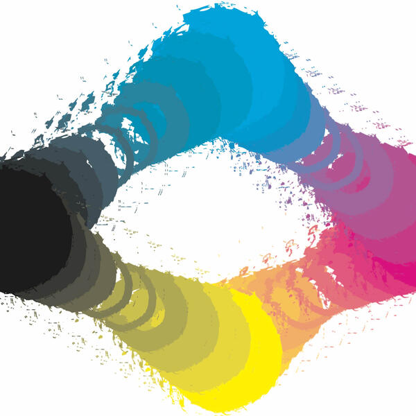
This course was taken in the Fall of 2017. It focuses on graphic design used as a communication tool and how it can be used to convey different emotions. Unorthodox methods were also incorporated to communicate messages such as using the only type to create a logo.
computer graphics
This course was taken in the Fall of 2016. Computer Graphics is an introductory course that focuses on Adobe Illustrator and vector images where different practices and techniques were taught and performed.
digital imaging
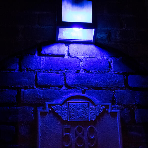
This course was taken in the Fall of 2018. Digital Imaging was a course that taught the fundamentals of photography with the use of a digital camera. Photos were then taken to Photoshop to be edited appropriately.
packaging design
This course was taken at Sejong University in the Spring of 2018 as an exchange program. The goal of this course was to create either a new brand or rebrand an existing one. Packaging must include a logo, a product, individual packages, and a large package as a container for the others. Each package was designed and printed and manually assembled.
relief printing
This course was taken in Spring of 2019. The course involved working with/on wood prints, solvent transfers, chine collé, embossment, and other techniques.
typography
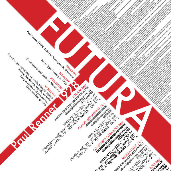
This course was taken in the Fall of 2017. It focuses on typography including the anatomy of type, the different forms of type, and more. With this knowledge, the type was thoughtfully selected for a purpose in multiple projects.
internship gallery
This page shows the projects that were completed as a graphic design co-op intern for the City of Jersey City in the Fall of 2019. Each project is under its appropriate post with a brief description of the departments involved and the process of the works.My learning objectives were the following:
To develop creative skills for graphic design.
To be able to problem-solve and multitask in a professional environment.
To understand the needs and develop a mutual goal for and with the client.

immigration booklet
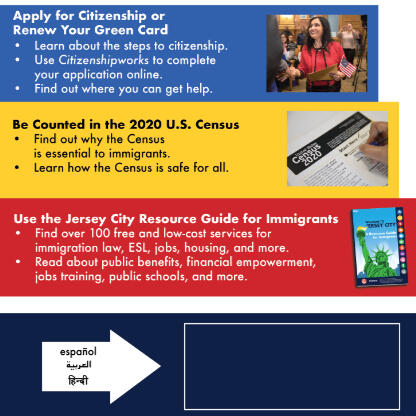
The immigration resource guide was created for distribution for the Department of Health and Human Services. With the increasing number of immigrants in Jersey City, it was necessary to create a resource guide. Since the guide would be used by different nationalities and languages, readability and universal icons were a priority. Each chapter is color-coded and coincides with its icon which can be seen throughout including the table of contents. Information that was deemed important information was inserted in a box of the chapter’s color. Specialized vector and rasterize images were also created when needed.
immigration postcard
The postcard contains the same design theme as the resource guide. The front is the same as the guide’s front cover only adjusted for landscape. The laptop and booklet vectors were designed especially for the postcard. Where the box outline is located in the designated location for a USB containing the guide in pdf form to be attached. An alternative version translated in Spanish was also created and slightly adjusted to contain the higher word count.
Miscellaneous Flyers
The following flyers are all from different, short projects that were completed for the Co-Op Internship. Details about the departments involved and the process for each flyer can be found in the captions after opening the image.
This flyer was created for a Public Meeting that was being held for the Office of Sustainability. The client was initially inspired by another town’s public meet flyer. The concept from the reference such as the color scheme and layout were kept throughout the process. More orange was added on the bottom to contrast with the blues. A silhouette vector of Jersey City was added to emphasize this was for the town’s public, without taking focus from the information above. Script fonts were also used as a secondary font to be lower on the hierarchy as they did not pertain to the actual information on the meet and were only incentives for coming.
Eid Milad Un-Nabi is the Islamic celebration of the prophet Muhammad’s birthday. Jersey City Cultural Affairs along with the Milad Committee of North America requested a flyer for the holiday asking for a similar design to the previous year. The color scheme along with a similar photo was kept in the design process. More negative space than the previous year was added to allow more breathing room. The festive background design was added and adjusted to not take the focus off the text.
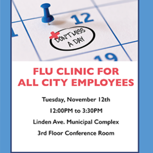
As flu season was approaching this flyer was requested by the Department of Health and Human Services for internal communication for City employees. The message was simple and used more visual elements to get the message across. The image of the calendar was used to emphasize the date and was adjusted to include the “handwritten message.” The message not only was used to express that the date of the clinic should not be missed but also sick days by the flu. The border is also to replicate a doctor’s clipboard.
Winter Event Campaign
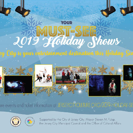
The following two ads were created for the Jersey City Cultural Affairs for its 2019 Holiday events. The brand of the events was titled “Your Must-See 2019 Holiday Shows” and a logo was created. “MUST-SEE” was given a gold motif, “2019 Holiday Shows” was given a snow-white, readable festive script font, and two blue snowflakes framed all of it together. The basic theme of the template was a blizzard with a color scheme of bluish-grey, gold-yellow, and white. Theater lights were added on top to emphasize that most of the events were theater shows. Since the flyer was more information-focused, the photos were framed in yellow at the top. The opposite is true with the Path ad. The overall layout reflects the flyer but with more focus on the photos which were framed with gold snowflakes. More ad layouts were to be created for the project, however, due to commitment to the immigration booklet project, I could not continue.
Misc Project Gallery
This gallery showcases miscellaneous projects that were done independently from university and internship. Each project includes a more detailed description.


St Francois County competition
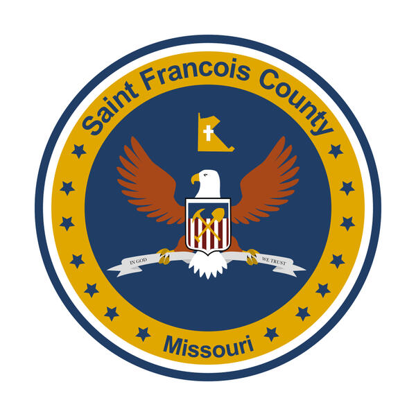
St. Francois County had become viral in early 2022 for its previous cluttered and rushed county seal. The county in response opened up a design competition which I decided to enter. I did not win any placings, however, it was a good experience to take part in.
Whole Foods Market Brochure
As the Team Trainer for the E-Commerce Department for Whole Foods, I was tasked to create a brochure for the mass transition of Amazon online shoppers to Whole Foods online shoppers in our local store. In order to ease the transition, the brochure includes store policies and information in both English and Spanish. Both versions of the brochure was printed in house and distributed to 70+ employees.
Cupsleeve Fan event
Designed for a fan event in a cafe scheduled for January of 2022 for a friend of mine. The project consisted of two cupsleeves and photocards that was printed and distributed to event goers.
Contact


